Social media image sizes for all networks [April 2026]
If you manage content across multiple platforms, image dimensions are no longer a design detail. In 2026, each network still crops, compresses, and previews assets differently, which means your creative can look sharp on one feed and broken

If you manage content across multiple platforms, image dimensions are no longer a design detail. In 2026, each network still crops, compresses, and previews assets differently, which means your creative can look sharp on one feed and broken on another.
Key takeaway: choosing the right social media image sizes is one of the fastest ways to protect visual quality and strengthen your social media marketing strategy.
This guide summarizes the practical sizes you need now, based on the latest roundup from Hootsuite’s April 2026 image sizes guide, plus official documentation where it matters. If you want a broader execution stack, Crescitaly’s services page shows how content support, optimization, and delivery can fit into a publishing workflow, while SMM panel services can help teams scale distribution once the creative is ready.
What changed in social media image sizes for April 2026
The biggest change in 2026 is not a single universal dimension. It is the continued fragmentation of placement types. Feeds, reels, story-style surfaces, profile headers, thumbnails, and link previews each follow different ratios. That makes one-size-fits-all assets risky.
Historically, teams could rely on a few “safe” dimensions for most networks. That is still useful as a benchmark, but it is no longer enough for current production. The right approach is to create a primary master file and then export platform-specific crops for each destination.
For creators and brands, this matters because the image is often the first conversion point. If a product shot is cropped badly, your caption has to work harder. If a banner text is cut off, your message loses clarity before the user even reads it. That is why image sizing should be treated as part of the content quality process recommended by Google: make the asset easy to understand, accessible, and aligned with the page or post intent.
- Prioritize ratio over absolute pixel perfection when publishing across multiple placements.
- Use high-resolution source files so compression does less damage.
- Reserve text-heavy designs for placements where cropping is predictable.
- Check previews on mobile first, since most social traffic is mobile.
Why image dimensions matter for your social media marketing strategy
Social media image sizes affect more than aesthetics. They influence click-through rate, dwell time, brand consistency, and whether your content survives platform compression. In practice, a poor crop can lower engagement even if the post copy is excellent.
For a strong social media marketing strategy, image sizing should support three goals:
- Clarity — the core message should be readable at thumbnail scale.
- Consistency — every post should feel like it came from the same brand system.
- Conversion — images should reinforce the action you want users to take, whether that is a profile visit, click, save, or share.
This is also where process matters. Teams that publish at volume can benefit from a structured service layer, such as Crescitaly’s services, because image production, scheduling, and promotion work best when they are coordinated instead of handled ad hoc. If you are distributing creator-led content, campaigns, or product updates, the asset format should be planned alongside the message and not after the post is already written.
On YouTube, for example, official guidance still emphasizes strong visual packaging for thumbnails and channel art. See YouTube’s thumbnail guidance for current best practices around legibility and file handling. The same logic applies across every network: the closer the image matches the intended placement, the less quality you lose.
Platform-by-platform image sizes that matter most
You do not need to memorize every dimension in the ecosystem. You do need the sizes that affect daily publishing. Below are the formats most teams should keep in their design library.
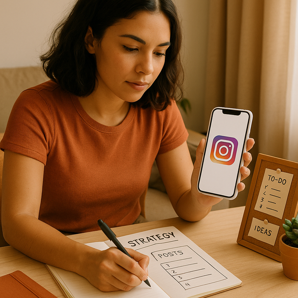
Instagram still rewards clean square, portrait, and story-style assets. A portrait ratio usually earns more screen space in feed contexts, while square works well for grid consistency.
- Feed portrait: 4:5 ratio
- Feed square: 1:1 ratio
- Stories and Reels-style assets: 9:16 ratio
Keep important text away from the edges on story-style creative, since interface overlays can cover key elements.
Facebook remains useful for page branding, event promotion, and community posts. Because previews vary across devices and placements, design with generous safe areas.
- Feed link preview and shared image: use a landscape-friendly crop where possible
- Profile image: square crop
- Cover image: wide horizontal format
For branded campaigns, avoid placing logos or CTA text at the far edges of cover art.
LinkedIn is more sensitive to image clarity than many teams realize. Since it is often used for professional content, low-resolution visuals can damage credibility.
- Single-image posts: square or portrait-friendly formats work best in feed
- Company page banner: wide horizontal format
- Shared link preview: ensure the thumbnail matches the article topic
If your LinkedIn content supports lead generation, make sure the visuals align with the message the click will deliver. That consistency improves both trust and conversion.
X, Pinterest, and YouTube
X favors compact, legible visuals in feed posts, while Pinterest continues to reward vertical content that fills screen space. YouTube is different: thumbnails must read instantly at small sizes, and official guidance stresses strong image clarity and appropriate file handling.
- X post visuals: use clear, high-contrast images with readable focal points
- Pinterest pins: vertical assets with strong hierarchy perform best
- YouTube thumbnails: prioritize clear composition and avoid overcrowding
Because YouTube thumbnails are so important to click behavior, it is worth following the official guidance from YouTube support rather than relying only on third-party summaries. If your team manages multiple formats, a centralized workflow from Crescitaly’s SMM panel services can help you keep posting cadence consistent while you adapt assets per network.
A practical workflow for publishing images without quality loss
The best image-size strategy is not to redesign every post from scratch. It is to build a repeatable workflow that protects resolution and keeps production efficient.
- Start with a master design file at a higher resolution than the final export.
- Create layout variants for the three most common ratio families: square, portrait, and vertical.
- Export platform-specific versions instead of relying on one universal crop.
- Review every asset on mobile before publishing.
- Archive the final dimensions in a shared brand library so the team can reuse them.
When publishing volume is high, the workflow can be integrated with content distribution and audience support. That is especially useful for agencies, creators, and ecommerce brands that need a fast turnaround. Crescitaly’s services can support that operational layer by reducing the friction between creative production and channel execution.
If you want your visuals to perform as part of a wider social media marketing strategy, make sure the image file name, alt text where available, caption, and landing page all tell the same story. Google’s SEO starter guide is a useful reminder that clarity, relevance, and user-first structure improve discoverability across channels, not only on websites.
Common image-size mistakes that hurt performance
Most image problems are preventable. Teams usually run into the same issues when they copy one asset across every platform without adapting the crop.
- Using one export everywhere — a feed graphic that looks great on Instagram may be cropped awkwardly in a story surface or preview card.
- Placing text too close to edges — interface overlays can cover key copy, logos, or CTA buttons.
- Uploading low-resolution files — compression will amplify blur, especially on larger screens.
- Ignoring mobile previews — a design that looks balanced on desktop may fail on a phone.
- Mixing brand systems — inconsistent spacing, font size, or logo placement makes a profile look less trustworthy.
The fix is not more design complexity; it is discipline. Set standard crops, define safe zones, and use platform checks before publication. That alone will improve the visual reliability of your content.
If you are operating at scale, it can also help to pair creative standards with a repeatable promotion stack. Crescitaly’s SMM panel services are useful when your team already has a polished asset but needs a faster way to support visibility, testing, or campaign rollout.
Sources and related resources
The specifications in this guide were cross-checked against Hootsuite’s April 2026 roundup, plus official platform documentation where available. For implementation, use the most recent in-product preview tools whenever a network offers them, because placement behavior can change without a major announcement.
Sources
- Hootsuite: Social media image sizes for all networks [April 2026]
- Google Search Central: SEO Starter Guide
- YouTube Help: thumbnail and channel image guidance
Related Resources
- Crescitaly Services — explore support options for campaign execution and content operations.
- Crescitaly SMM Panel — review a scalable option for social distribution workflows.
When you combine accurate image sizing with a clean publishing workflow, you reduce wasted effort and improve every post’s odds of being understood quickly.
FAQ
What is the best image size for social media in 2026?
There is no single best size. The most reliable approach is to design around the platform’s dominant ratio: square, portrait, or vertical, depending on the placement.
Should I use the same image for every platform?
You can reuse the same concept, but not always the same crop. Adapting the size for each network usually preserves quality and improves performance.
Do image sizes affect engagement?
Yes. Cropped text, blurry files, and awkward previews can reduce clicks, saves, and shares because the post looks less trustworthy or harder to understand.
How often should I update my image-size library?
Review it at least quarterly, and immediately if a platform changes its layout, profile branding, or preview behavior.
What file format is best for social media graphics?
Use the format that preserves clarity for your asset. PNG is often better for logos and text-heavy graphics, while JPEG is usually fine for photographs.
Where should I place text on social media images?
Keep text inside a central safe zone, especially for story-style formats and thumbnail placements where UI overlays can cover edges.
How does this fit into a broader social media marketing strategy?
Correct image sizes support clarity, consistency, and conversion. That makes your social media marketing strategy more efficient because each post works harder before the user even reads the caption.